Friday, 8 April 2011

Initial Digipak Ideas


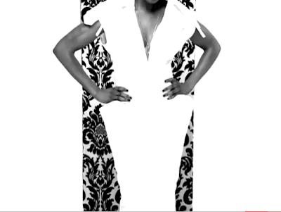
I want to create a 6 panel digipak, on the inside of the digipak, i want an image to go across the the centre and left panel, with the two artists standing in one corner with a eye grabbing backdrop behind them taking over most of the two panels.
Skywriting


Front cover will include mid shot of Sifa and her leaning on a street name sign, that I will be giving the name of the song below the image the name of the artist will be placed and we will get a clear view of iconic image of London at the background. The back cover will  include many different images of the artists in different type of shots with different use of coloured backgrounds, image sizes will be small so that roughly 30 - 40 different images will be included. The left side of the inside cover will include the list of the other songs within the album on the continues view of London. The CD will be plain white background with the name of the artist, (Sifa) in red. The colour code for this product will be black/white with use of red. With the design idea I am aiming to appeal to the target audience which this is the main reason that  I am not going for a very complicated style of design and making sure that style of the genre is clear within the product for it appeal to the target audience. 

Friday, 1 April 2011

Evaluation

In what ways does your media product use, develop or challenge forms and conventions of real media products?


Our music video both uses and challenges forms and conventions of the RnB genre. One of the most obvious and most typical conventions of RnB is the way women are portrayed, whether they are the main artist, backup dancer, backup singer etc. They all come across as being the same. In the RnB genre the chances of making a video with no site of a female in it, are close to none. This genre is well known for its close up, slow motion shots focusing on the female body or even certain body parts. 


As you can see, this video has a numerous amount of shots focusing on females. The clothing used in the video brings out a sexual meaning in the way the ladies should be viewed. There are some slow motion tracking and panning shots which focus only on certain parts of the female body, we have used this idea and concept but in doing so have left out the lack of clothing theme and obviously are main atrist


One of the main ways in which it uses typical elements of a Funky House music video is through the use ofcamera shots and movement, editing, lighting, colour and costume. Through our research, we found that many Funky House music videos used various camera shots and fast pace editing to cut with the beat of the music. We liked this as the Funky House genre is particularly known for its beat and clubbing/dancing feel, so we felt that it was important to emphasize this by cutting on the beat. A music video that wewere influenced by was Donaeo – Party Hard as the chorus (which is the most prominent part of the song) has lots of camera movement and fast pace editing which helps to create a ‘funky’ atmosphere.


Here you see how the "American Boy' video has influenced us into using certain shots similar to ones seen in it. A medium shot of Estelles body figure is captured with a contrasting background which really exaggerates her body and causes her to stand out. In our video we have a shot of Stephanie Jackson focusing on her body and again similar to the "American Boy" video using a contrasting background which powerfully causes the artist to draw maximum attention from viewers. This also brings out a sex appeal factor to the artists aura, revealing her sexiness to viewers, appealing mostly to the male audience and a role model figure to the females.